Klarna · Banking

The story of designing Klarna's consumer banking sign-up — from first prototype to a launched flow that made young Europeans excited to bank with Klarna.
Senior Product Designer · Sign-up lead
2020 – 2022
Mobile (iOS · Android) + Web
0 → 1 sign-up · Europe
Product, Engineering, Compliance, Brand, Research
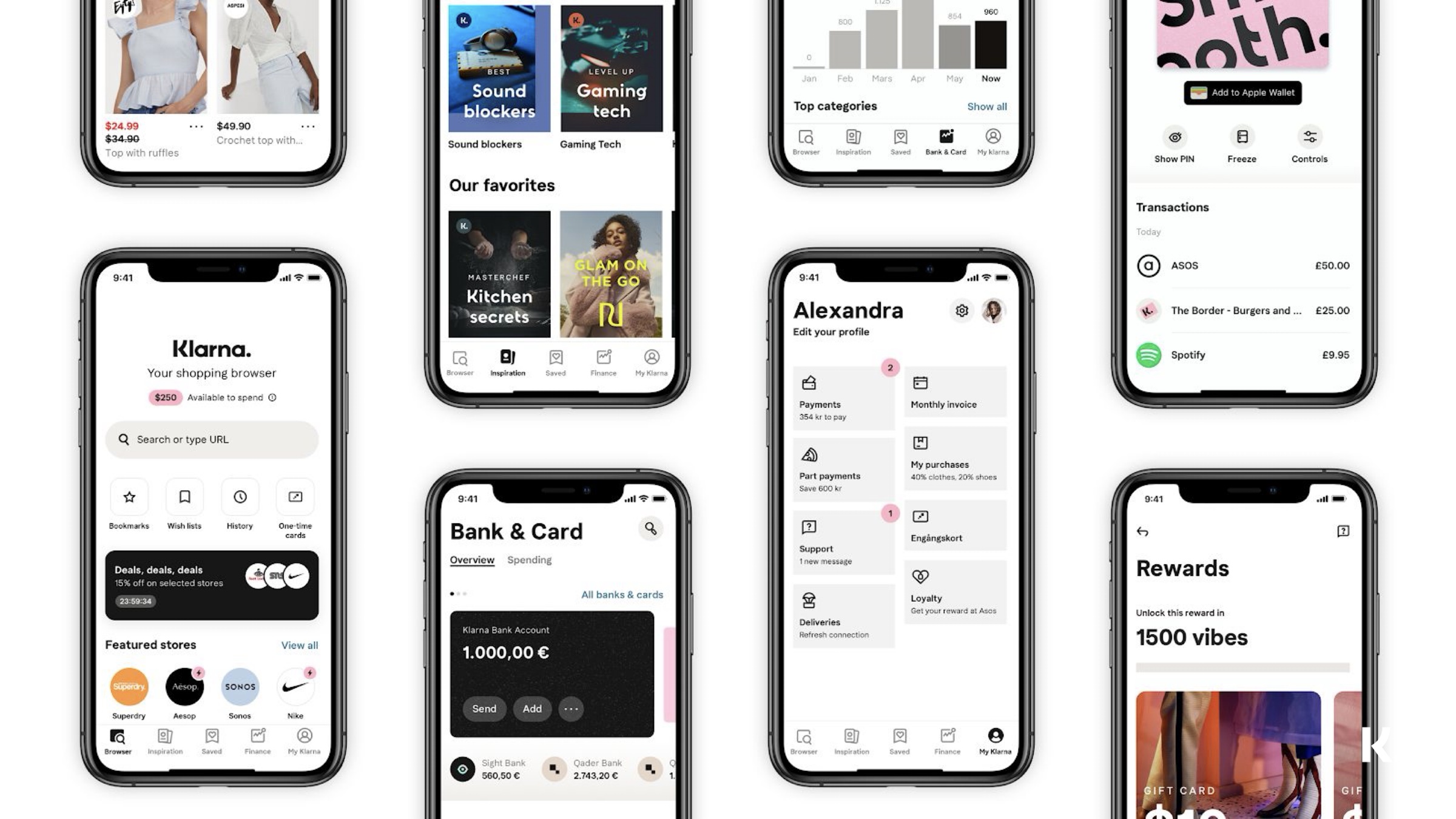
A grid of Klarna app screens on a neutral grey backdrop — shopping browser, inspiration, saved, Bank & Card, profile, transactions, rewards — laid out across stylized iPhone frames.

Klarna at the time

By 2020, Klarna was the world's largest fintech most people had never used to actually bank — over 90 million consumers, more than 250,000 merchants, and around two million transactions on an average day, served from 17 core markets across three continents. The company had brand permission, a direct relationship with shoppers, and an obvious next move: turn checkout users into banking customers.

The brief

Create an excellent first impression for Klarna's Consumer Banking products and offer a sign-up experience that makes young Europeans excited about banking with Klarna.

Where it all started

Week one looked like this. Before opening Figma we mapped the territory on a whiteboard: the two sign-up flavours we'd ship (dedicated sign-up + dynamic sign-up), the parallel tracks of generative research, benchmarking, and concept exploration, the product principles we'd hold the team to — fast & simple, less paperwork, explain extra data requested, good KYC/SCA — and the three-step backbone of any account opening: Basic info → Verification → Activation.
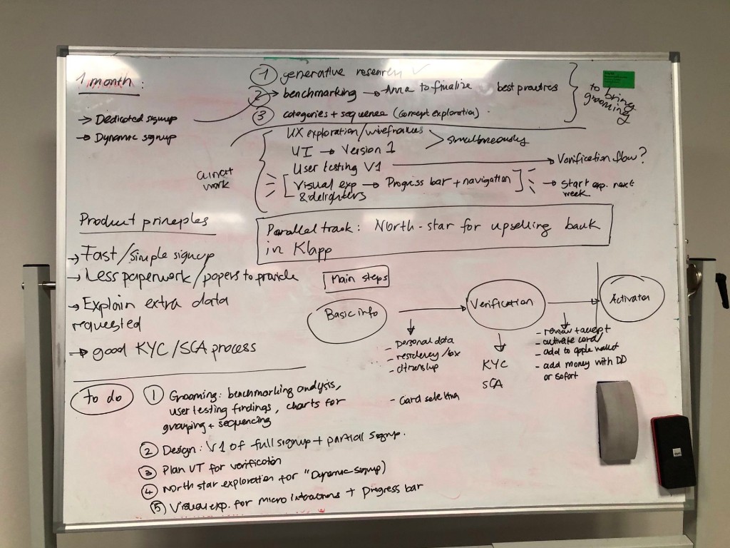
Photo of a whiteboard covered in handwritten planning — a 1-month roadmap on the left (dedicated sign-up, dynamic sign-up), three workstream branches (generative research, benchmarking, categories + sequence), product principles down the left column (fast/simple, less paperwork, explain extra data requested, good KYC/SCA), a parallel North-star track for upselling Bank in the Klarna app, and a three-circle flow at the bottom: Basic info → Verification (KYC, SCA) → Activation (review T&C, activate card, add to Apple Wallet, add money via DD or Sofort). A to-do list runs along the bottom edge.

Where I focused

The Klarna Banking customer journey runs from first touch through explore, getting familiar, decide, commit, and finally use. Onboarding and activation span the back half of that journey — and within onboarding, sign-up is the surface where intent becomes a real bank account. That's the problem I owned end-to-end.
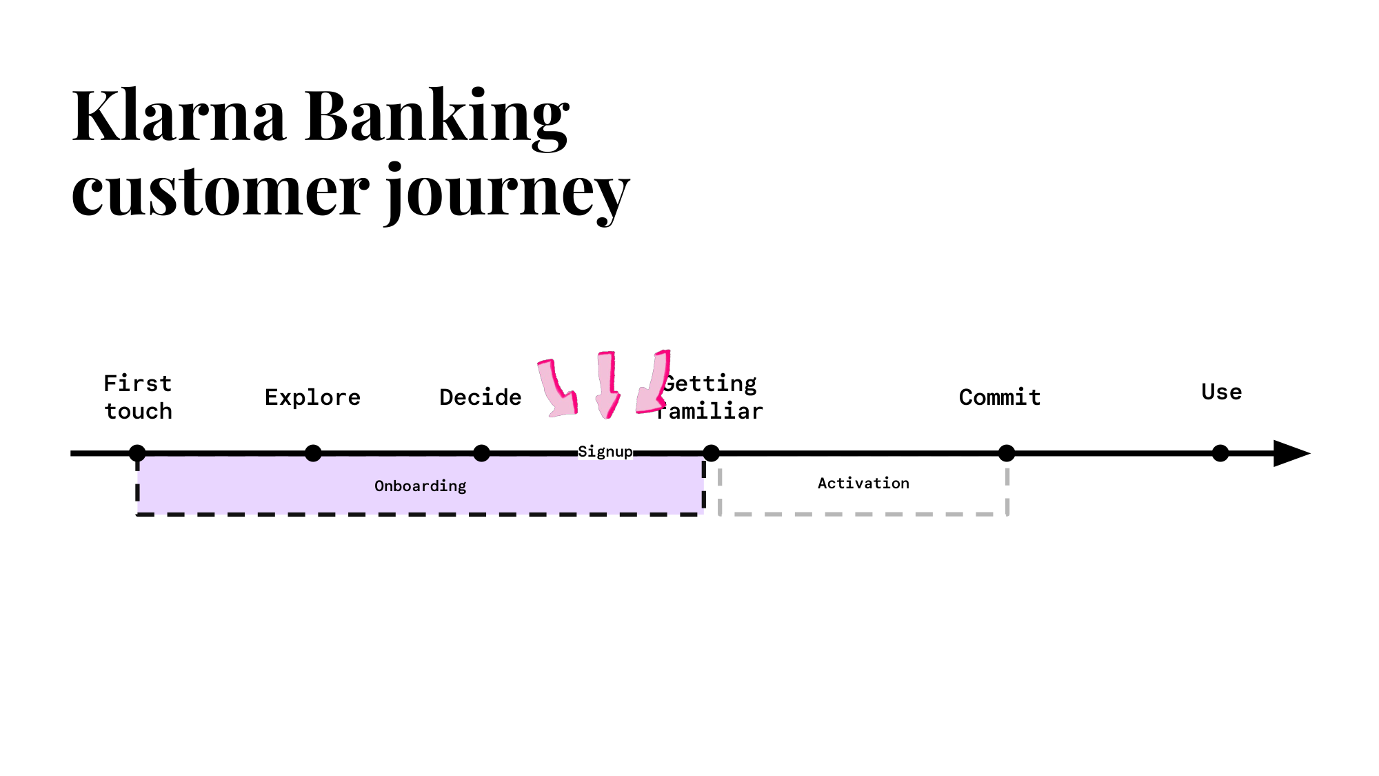
Customer journey timeline from First touch → Explore → Decide → Getting familiar → Commit → Use, with the Onboarding segment outlined in lilac, Activation outlined in dashed grey, and three pink arrows pointing down at Signup.

Persona — Curious Cupi

A digital nomad with simple banking needs, but curious about the features and apps that empower her financial life. Cupi was the lens for every decision: she'd give us her time and trust, but only if we earned both step by step.
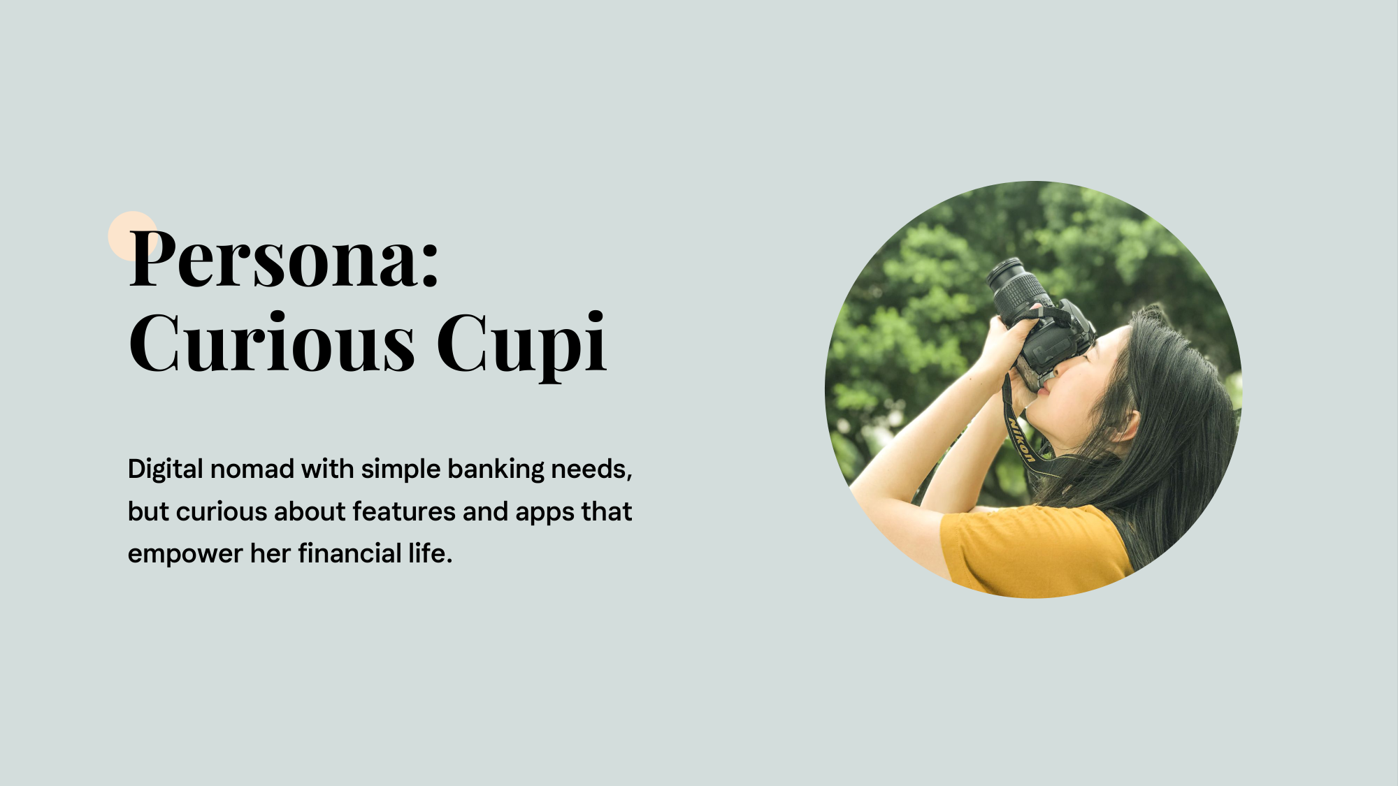
Persona slide for Curious Cupi — short description beside a circular photo of a young woman lifting a camera to her eye outdoors.

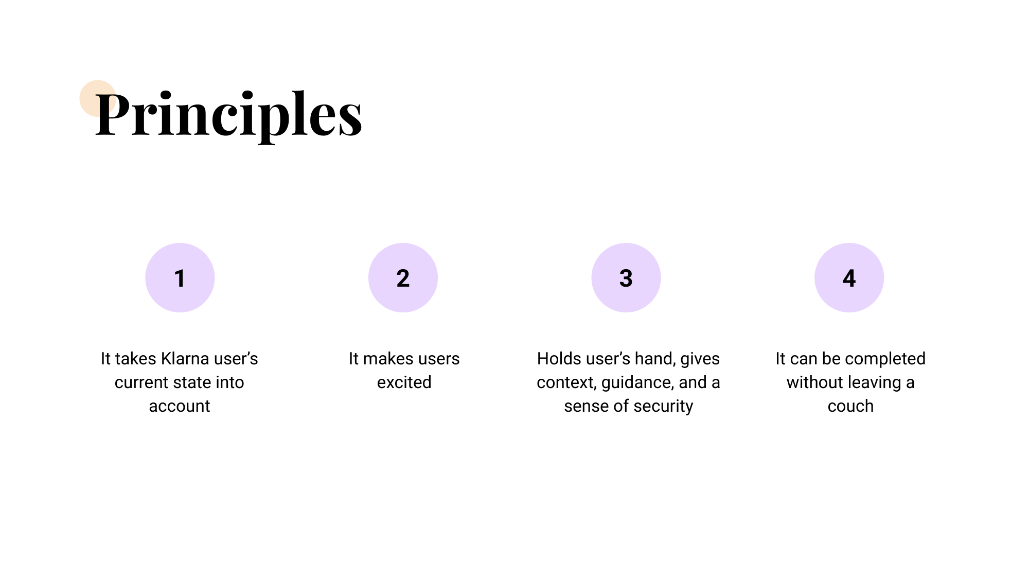
Principles

Four lilac circles numbered 1–4 captioning the four sign-up principles: takes the Klarna user's current state into account, makes users excited, holds the user's hand with context and a sense of security, can be completed without leaving the couch.

Metrics we tracked

Research — the N26 sign-up study

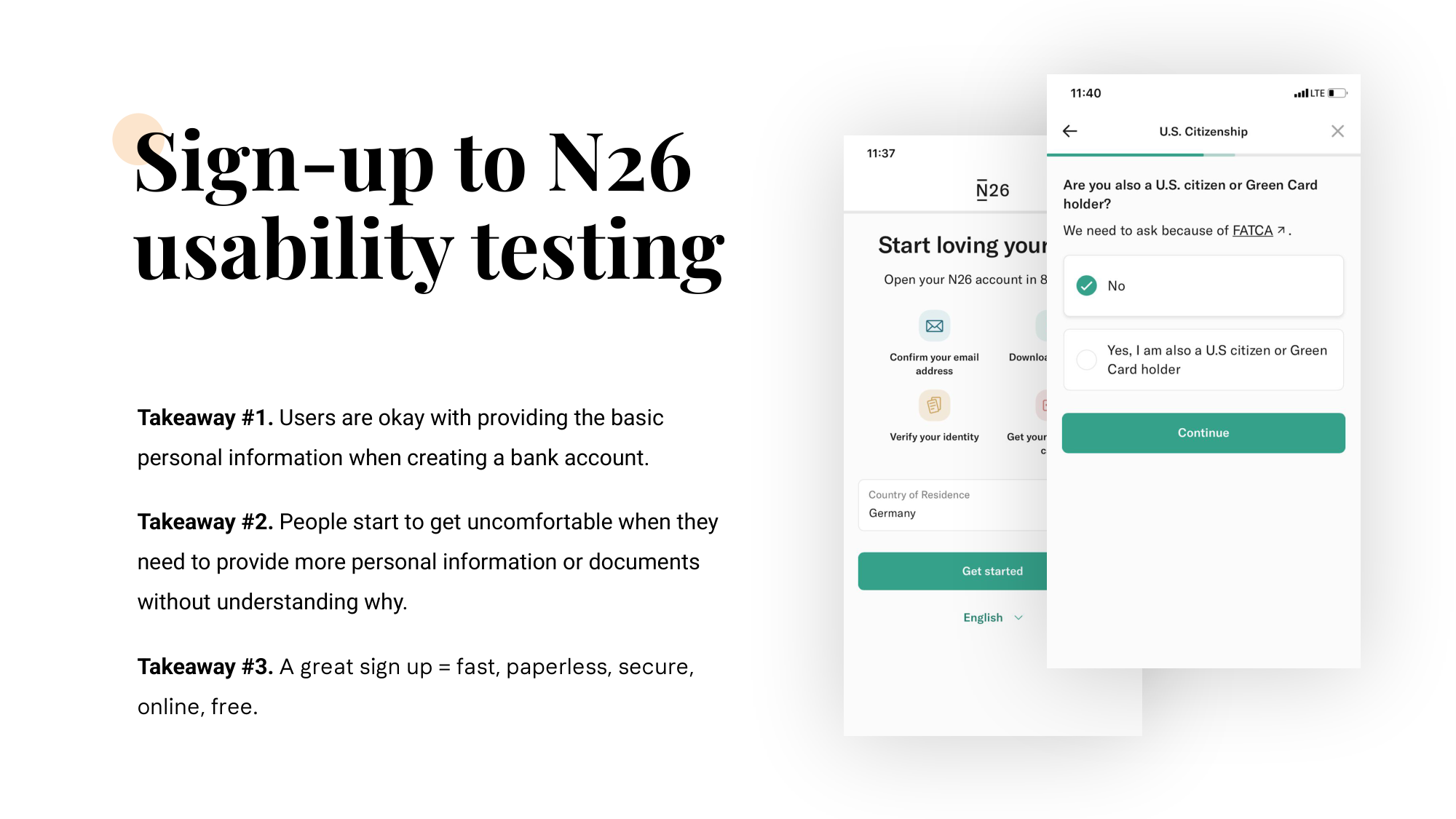
Before designing, we ran usability testing on a competitor sign-up — N26 — to anchor the team in what good felt like. Three takeaways carried into our work:
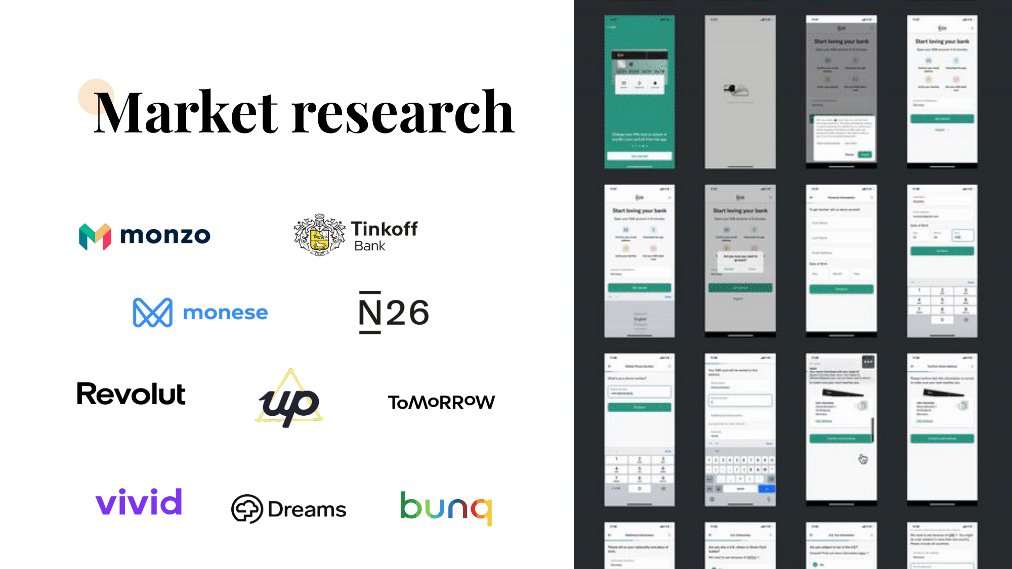
Logos of the ten competitor neobanks we benchmarked — Monzo, Tinkoff Bank, Monese, N26, Revolut, Up, Tomorrow, Vivid, Dreams, Bunq — laid out in a four-row grid.
Three takeaways from the N26 usability study printed next to two N26 sign-up screens — country of residence and U.S. citizenship questions.
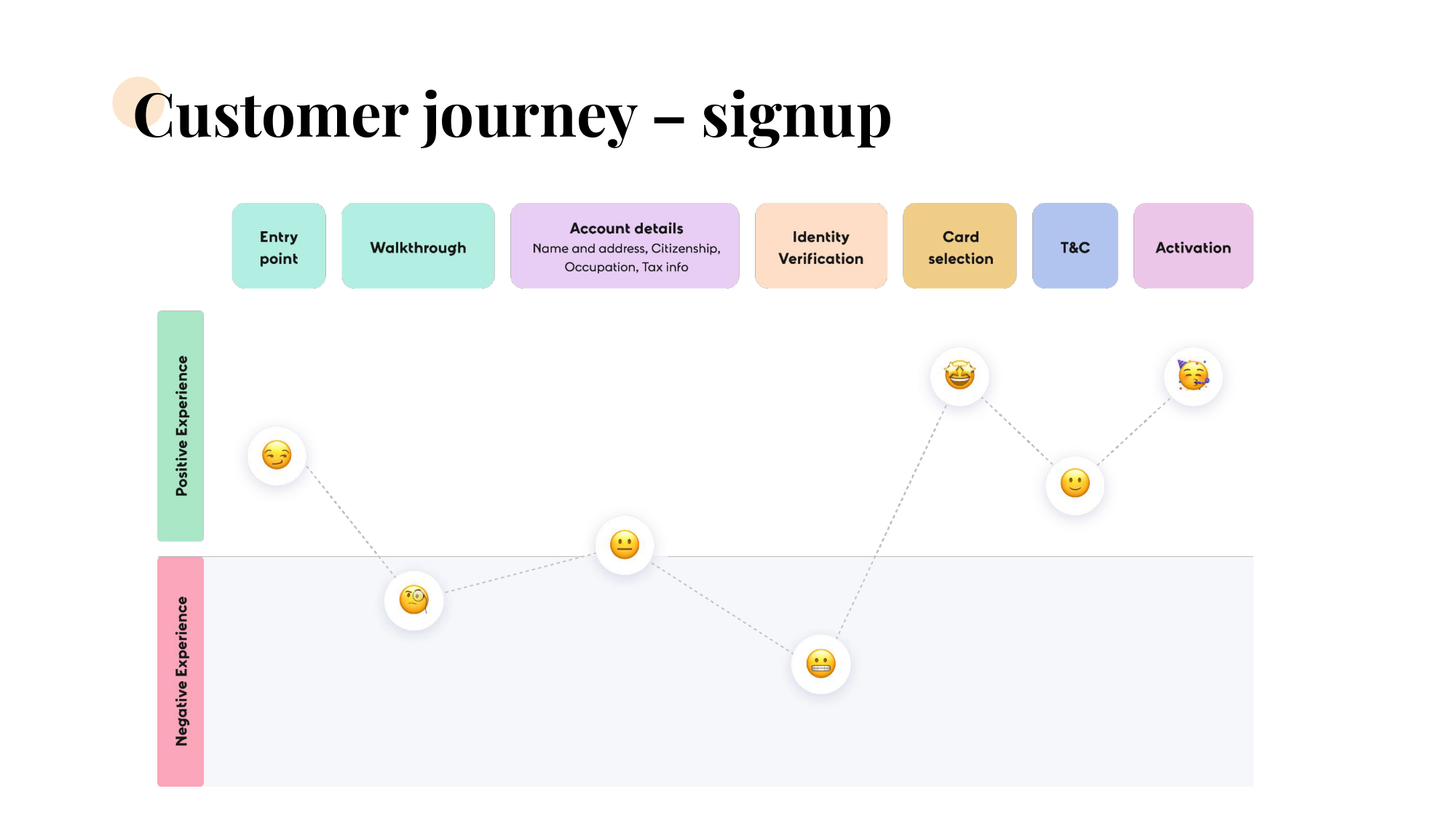
Customer-journey emotional curve across seven sign-up steps — entry point, walkthrough, account details, identity verification, card selection, T&C, activation — with emoji markers tracing where users felt positive versus negative.

Challenge 1 — A long form for serious data

Opening a bank account requires a lot of regulated information by law. Early prototypes felt long and complicated, and confidence dropped at the exact step where users had been asked to invest the most.
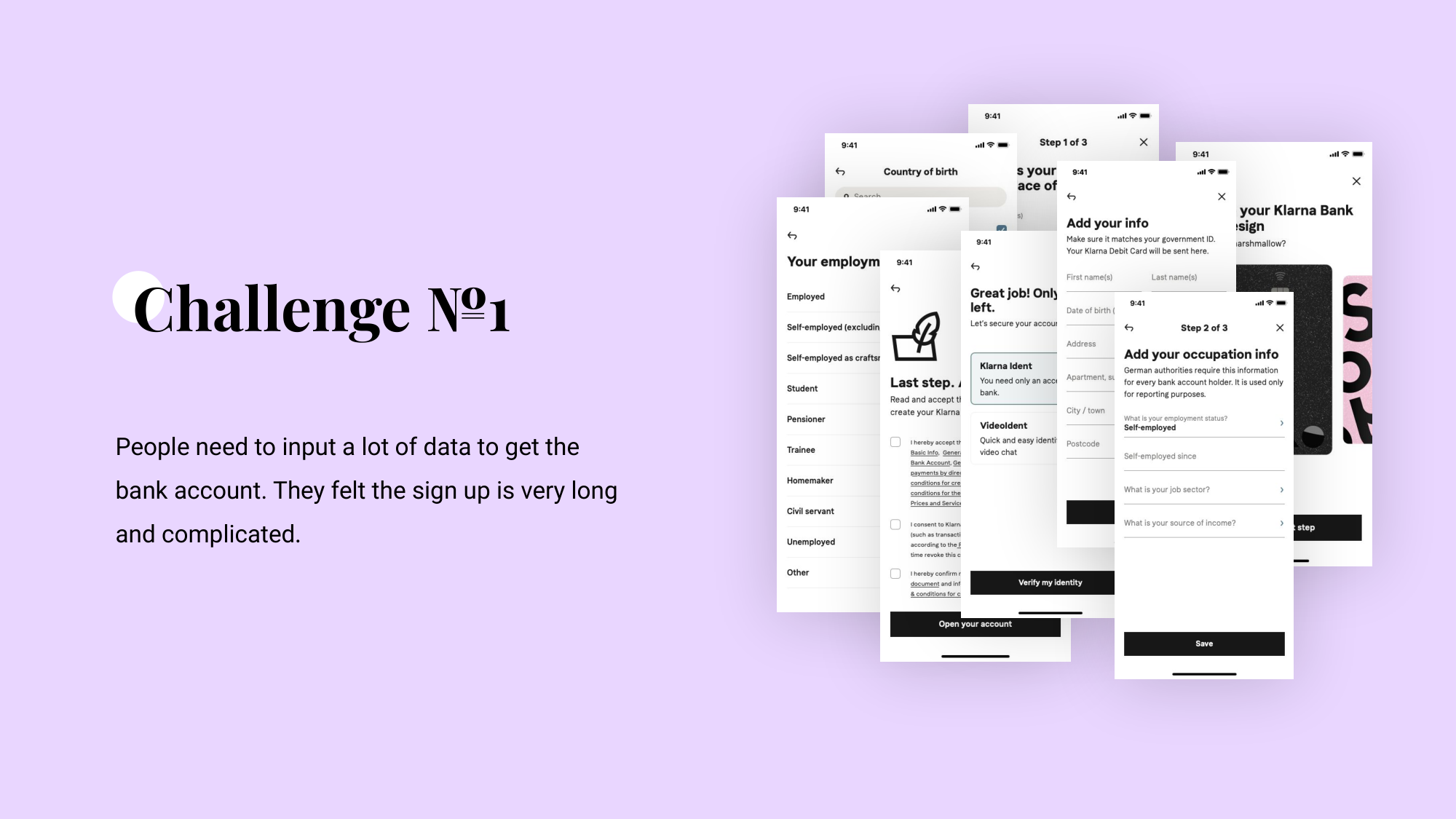
Challenge №1 slide on a lilac background — fanned stack of early Klarna sign-up screens covering employment status, country of birth, add your info, add your occupation info, verify my identity, and open your account.
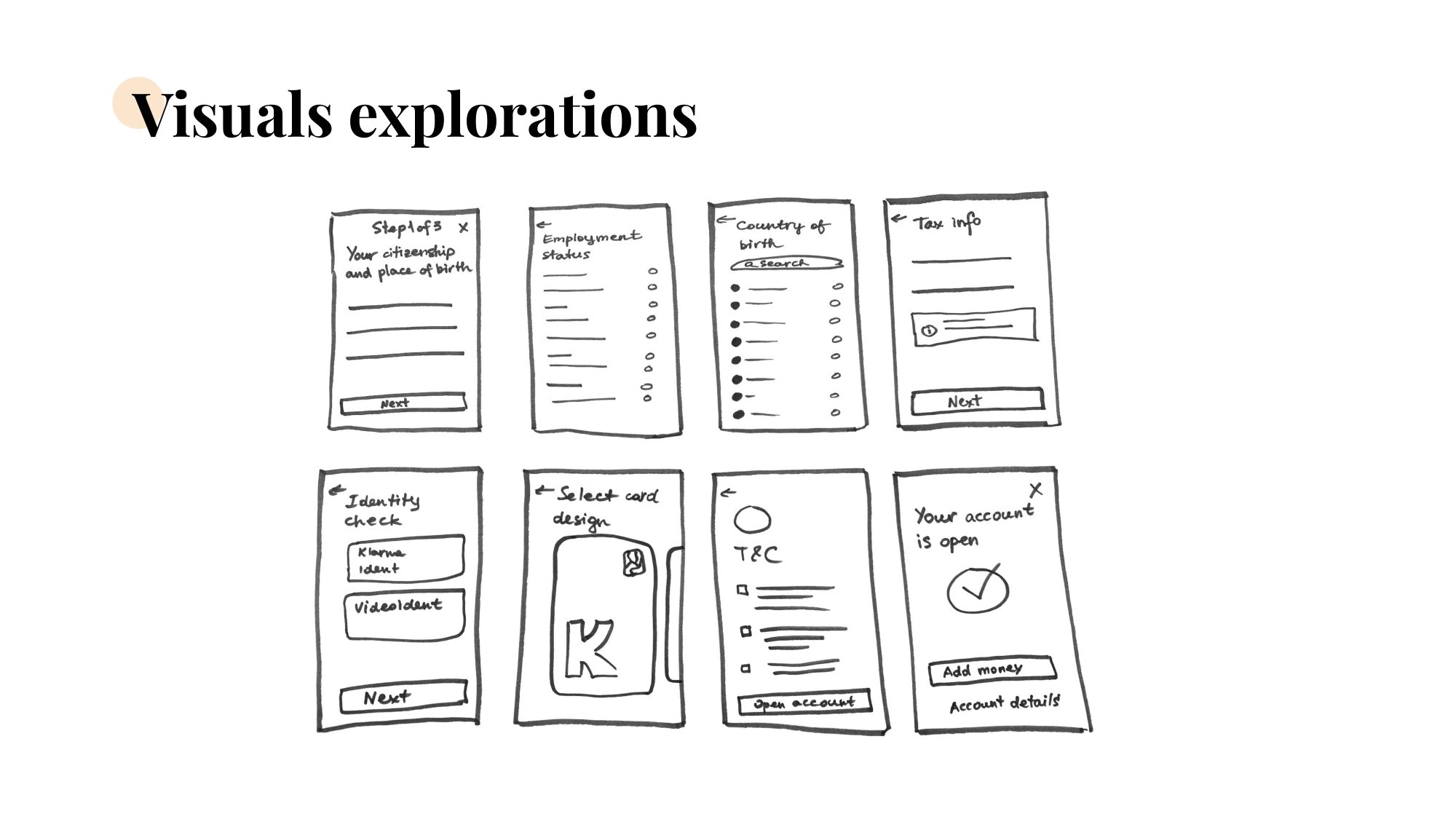
Hand-drawn wireframes of eight sign-up steps on a whiteboard — from 'Step 1 of 5 — your citizenship and place of birth' through 'Your account is open'.

Two navigation concepts, one pick

Horizontal progress bar — could reuse Klarna's existing component, but it couldn't carry detail about what was coming next, made the flow feel even longer, and was harder to navigate. Rejected.
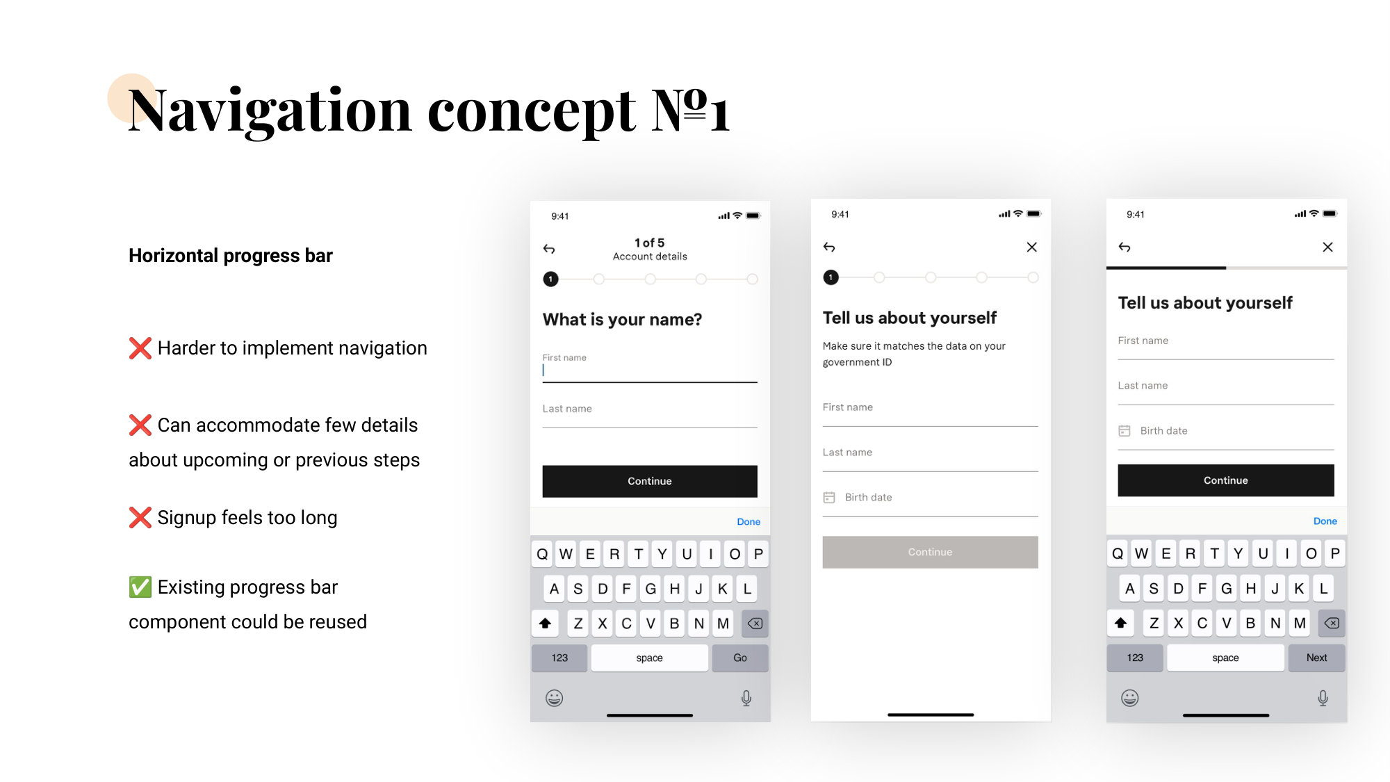
Navigation concept №1 — horizontal progress bar across three sample sign-up screens, with pros and cons listed beside it.

Vertical progress bar — every step visible, easier to navigate forward and backward, scalable as the flow grew. Required building a new component, but the trade-off was clearly worth it.
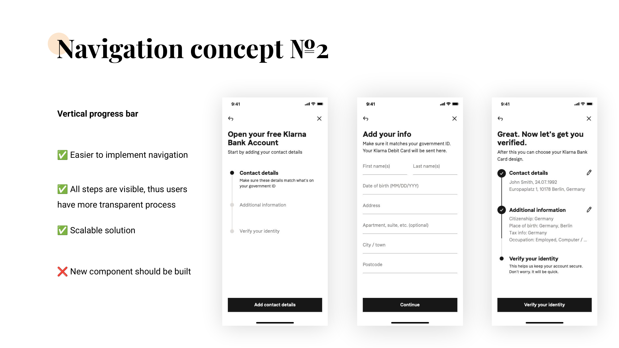
Navigation concept №2 — vertical progress bar with Contact details, Additional information, Verify your identity stacked down the left side of three Klarna sign-up screens.

Three patterns that made it work

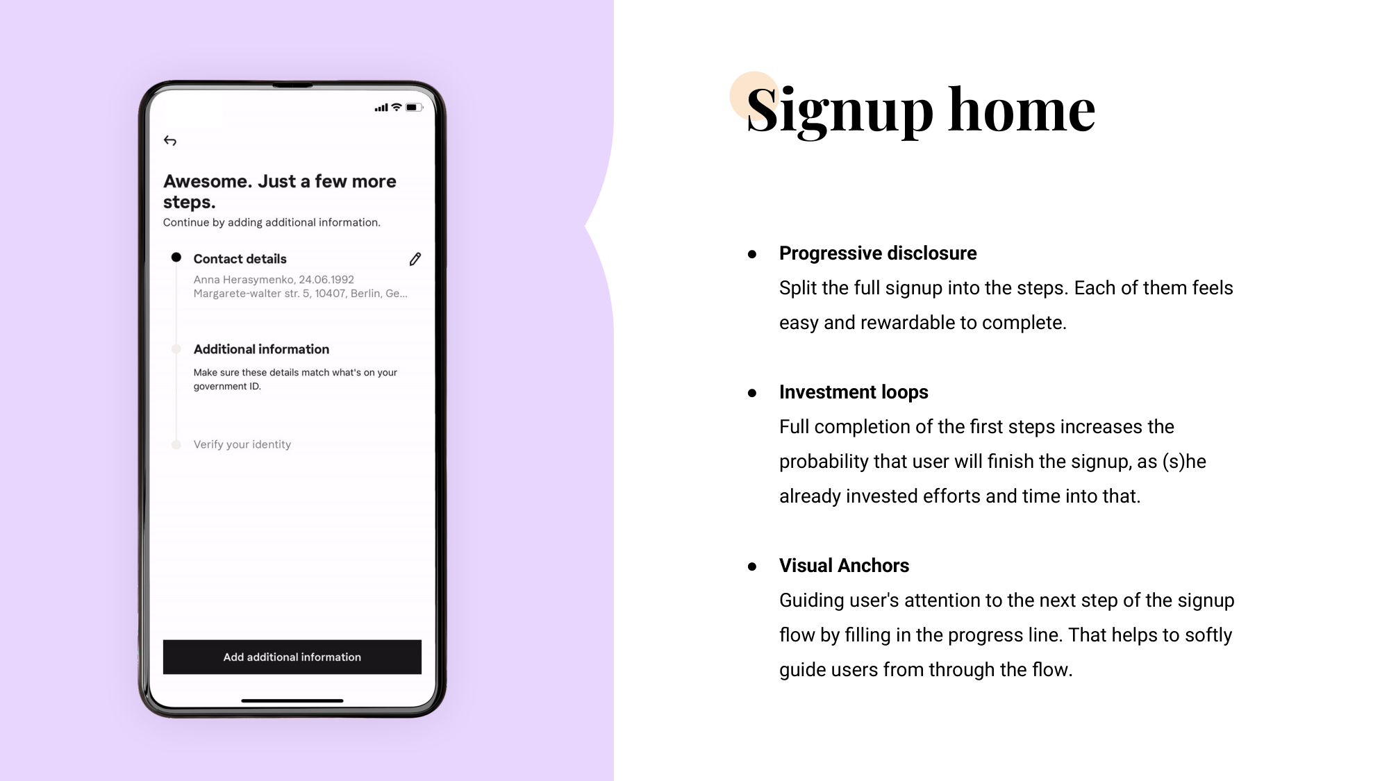
Sign-up home screen — 'Awesome. Just a few more steps' with Contact details ticked off and Additional information & Verify your identity ahead — beside a description of progressive disclosure, investment loops, and visual anchors.
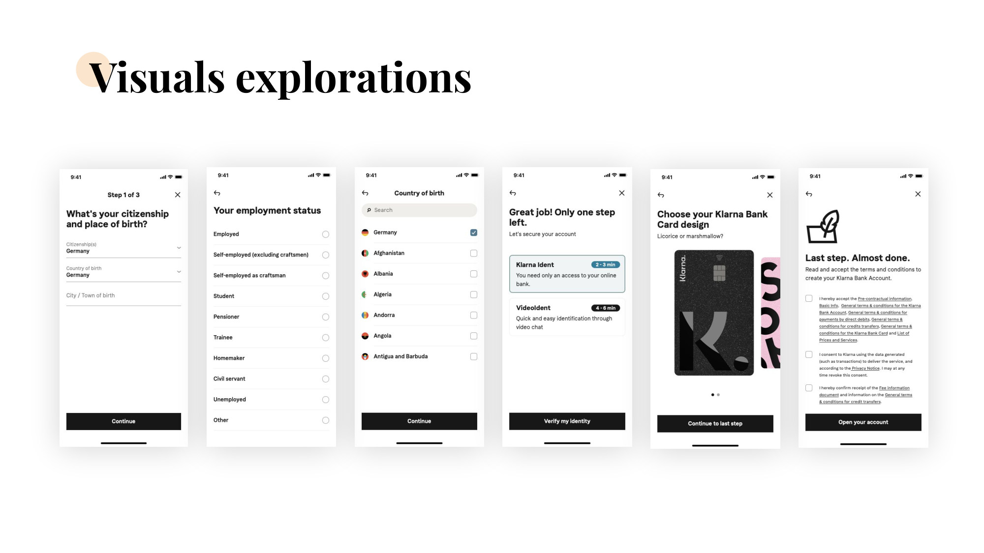
Visuals exploration — final shipped sign-up screens in sequence: citizenship and place of birth, employment status, country of birth, identity verification choice, card design selection, and terms & conditions.

Challenge 2 — Card selection mid-flow

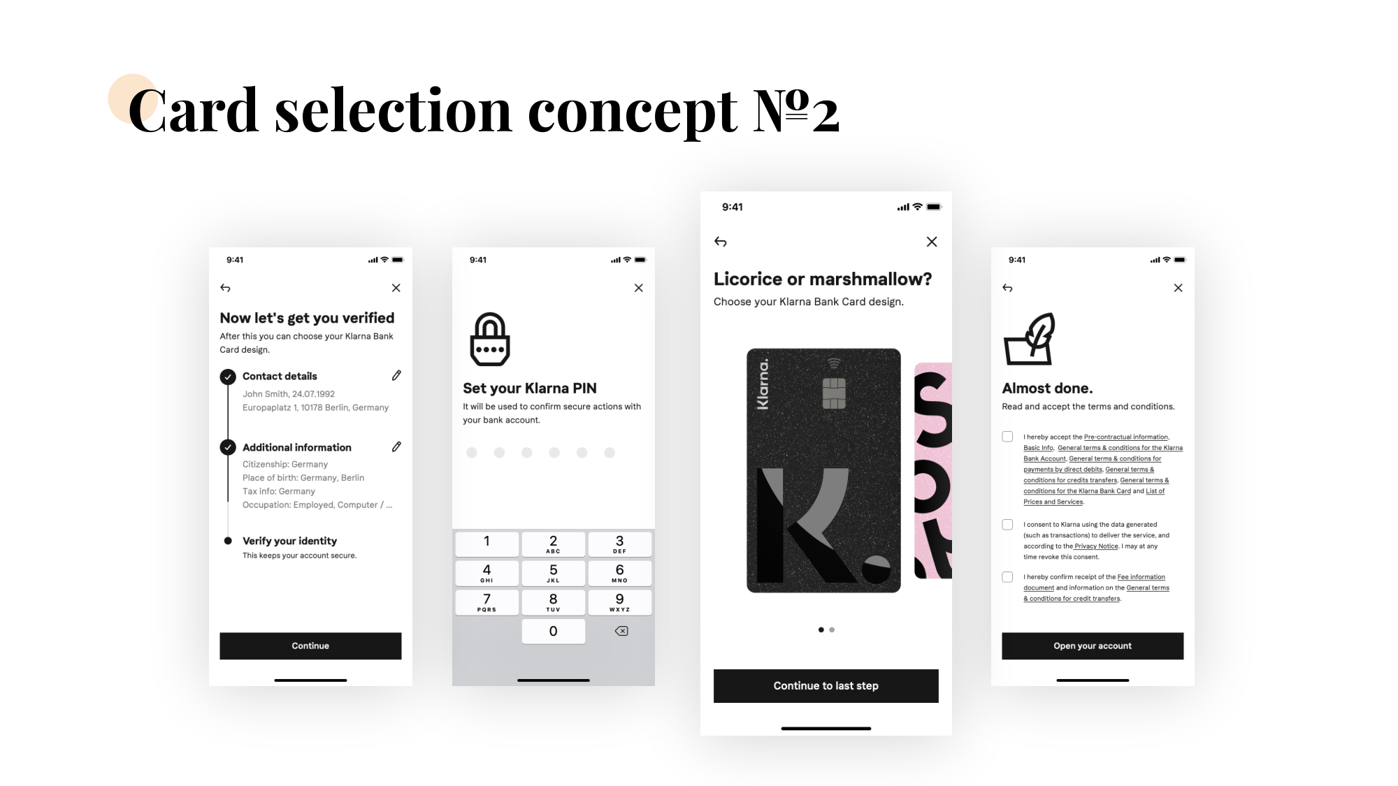
We hadn't planned for users to pick a card design during sign-up — the physical cards looked the same across our banking and credit products. But once we tested, it was clear card selection had to live inside the flow, not after it. Tucking the choice in mid-journey gave users an early visual win without disrupting the form rhythm.
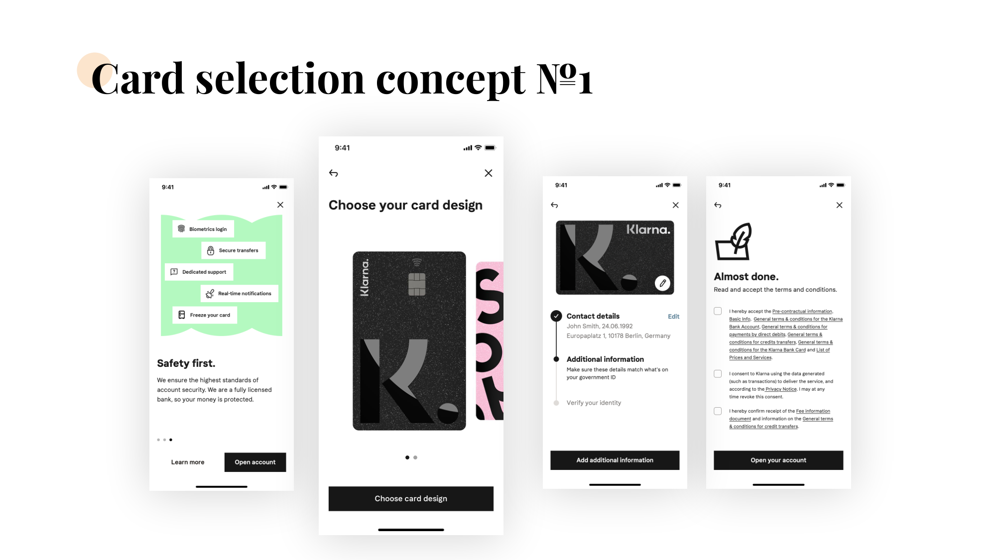
Card selection concept №1 — four screens placing the card design choice between safety reveal, choose-your-card-design, contact details, and almost-done T&C.
Card selection concept №2 — four screens: 'Now let's get you verified', Set your Klarna PIN, 'Licorice or marshmallow? Choose your Klarna Bank Card design.', and the final terms & conditions step.

Challenge 3 — Energy after sign-up

Users invest real time and emotional effort in opening a bank account. The moment they finish, they're scanning for something to do.
A success screen that earns the moment

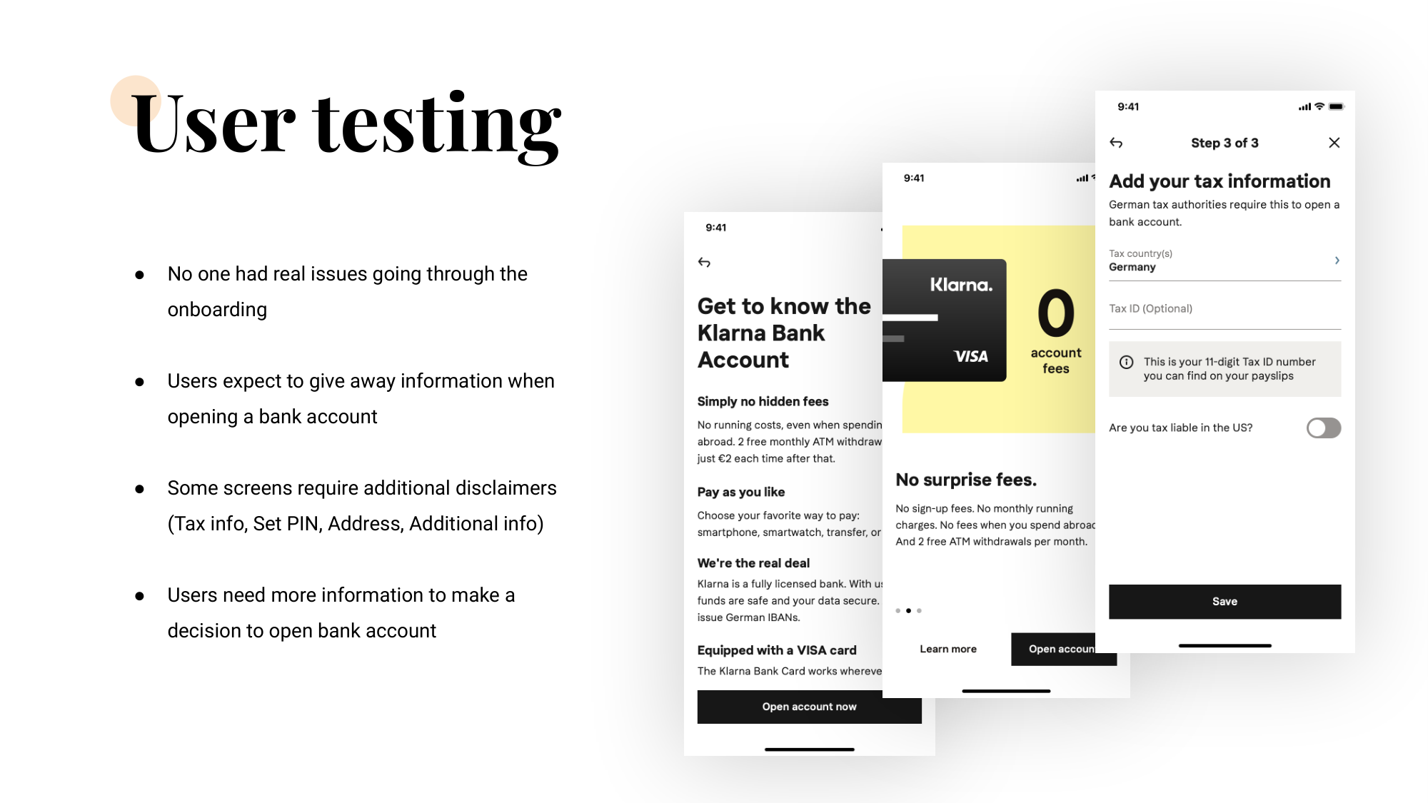
User testing — what held up

Three Klarna sign-up screens fanned out — 'Get to know the Klarna Bank Account' with hidden-fees explainer, a 'No surprise fees' marketing screen with the Klarna VISA card on yellow, and the 'Add your tax information' step asking for German tax country and Tax ID.

UX writing & product marketing

Sign-up is mostly text — labels, microcopy, disclaimers, success states. I worked closely with brand and product-marketing teams so the sign-up's voice matched the marketing pages users arrived from, and so regulated copy didn't feel like a hand-off to a different product.
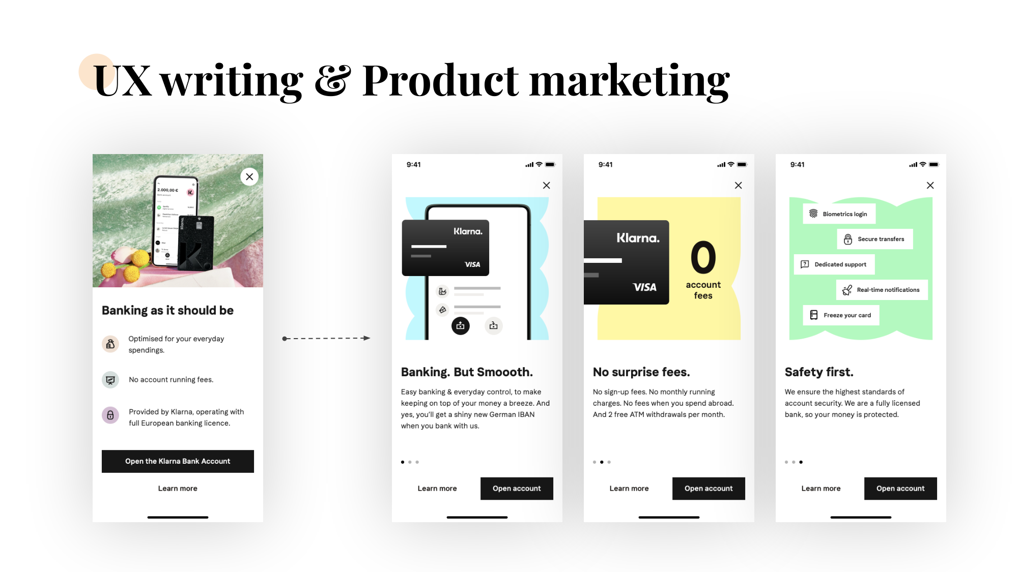
UX writing & product marketing slide — the 'Banking as it should be' marketing card pointing at three onboarding screens: 'Banking. But Smoooth.', 'No surprise fees', 'Safety first.'

Monitoring after launch

We watched both signal types in parallel.
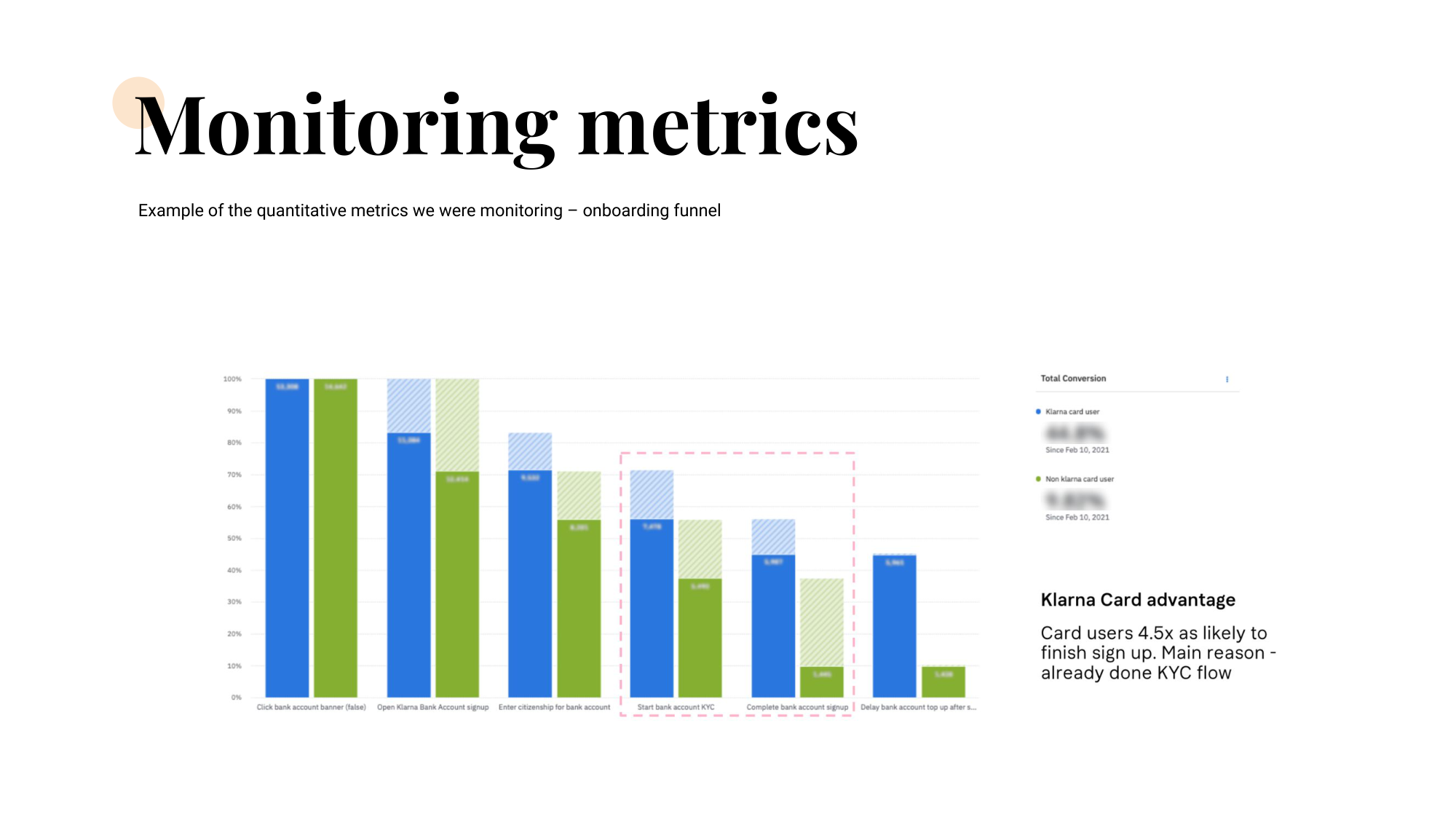
Onboarding funnel chart — step-by-step conversion comparing Klarna card users (blue) against non-card users (green), with a callout that card users are 4.5× more likely to finish sign-up because they have already completed KYC.
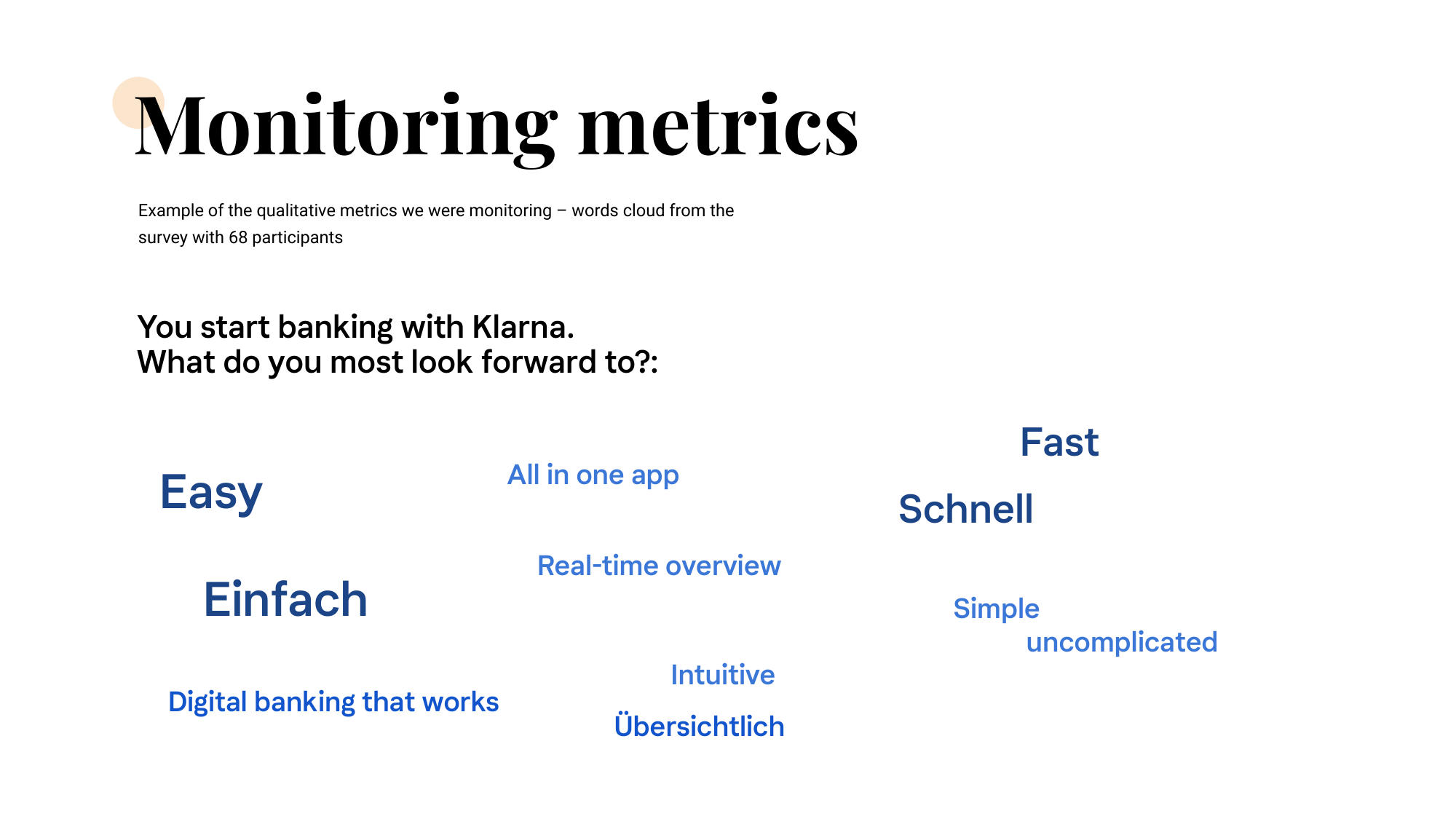
Word cloud from a 68-participant post-launch survey — Easy, Einfach, Fast, Schnell, Simple, Intuitive, Übersichtlich, All in one app, Real-time overview, Digital banking that works, uncomplicated.

Where it landed

What got shipped, end-to-end: a Banking. But Smoooth. entry point that doubled as the marketing surface, a verification flow that showed every step of KYC at a glance with edit affordances on each block, and an account-created moment that confirmed the card was on its way alongside the next likely step. Three screens, one continuous voice from marketing to onboarding to success.
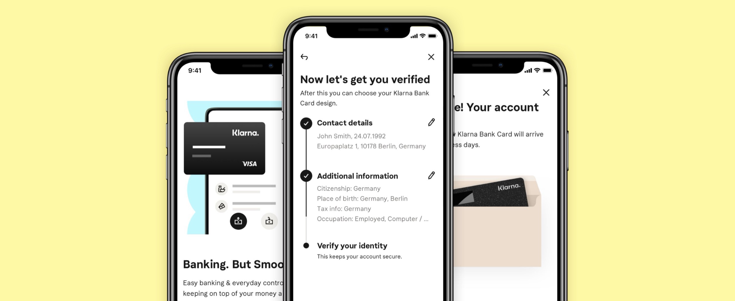
Three Klarna sign-up screens overlapping on a yellow backdrop — left: the marketing entry point with the black Klarna Visa card and the heading 'Banking. But Smoooth.'; center: the 'Now let's get you verified' verification flow with Contact details, Additional information, and Verify your identity broken into editable blocks; right: the 'Your account' success screen showing the Klarna Bank Card on its way in a packaging envelope.

Impact

0 → 1 launch of Klarna's consumer banking sign-up across Europe.

Klarna card users converted 4.5× better through sign-up than non-card users.

Post-launch survey: new users described the flow as simple · fast · intuitive.

Card-selection mid-flow became a durable activation pattern reused across products.

Learnings

Looking back

As featured in

0 → 1 Product Design Sign-up & KYC Funnel optimisation Regulated-product UX Persona-led design Cross-functional leadership UX writing partnership Quantitative + qualitative monitoring