Delivery Hero · Location
Rebuilding delivery-address selection from text-only autofill into a map-based picker — validated by riding along with couriers in Pakistan and scaled across the platform.
Rebuilding delivery-address selection from text-only autofill into a map-based picker — validated by riding along with couriers in Pakistan and scaled across the platform.
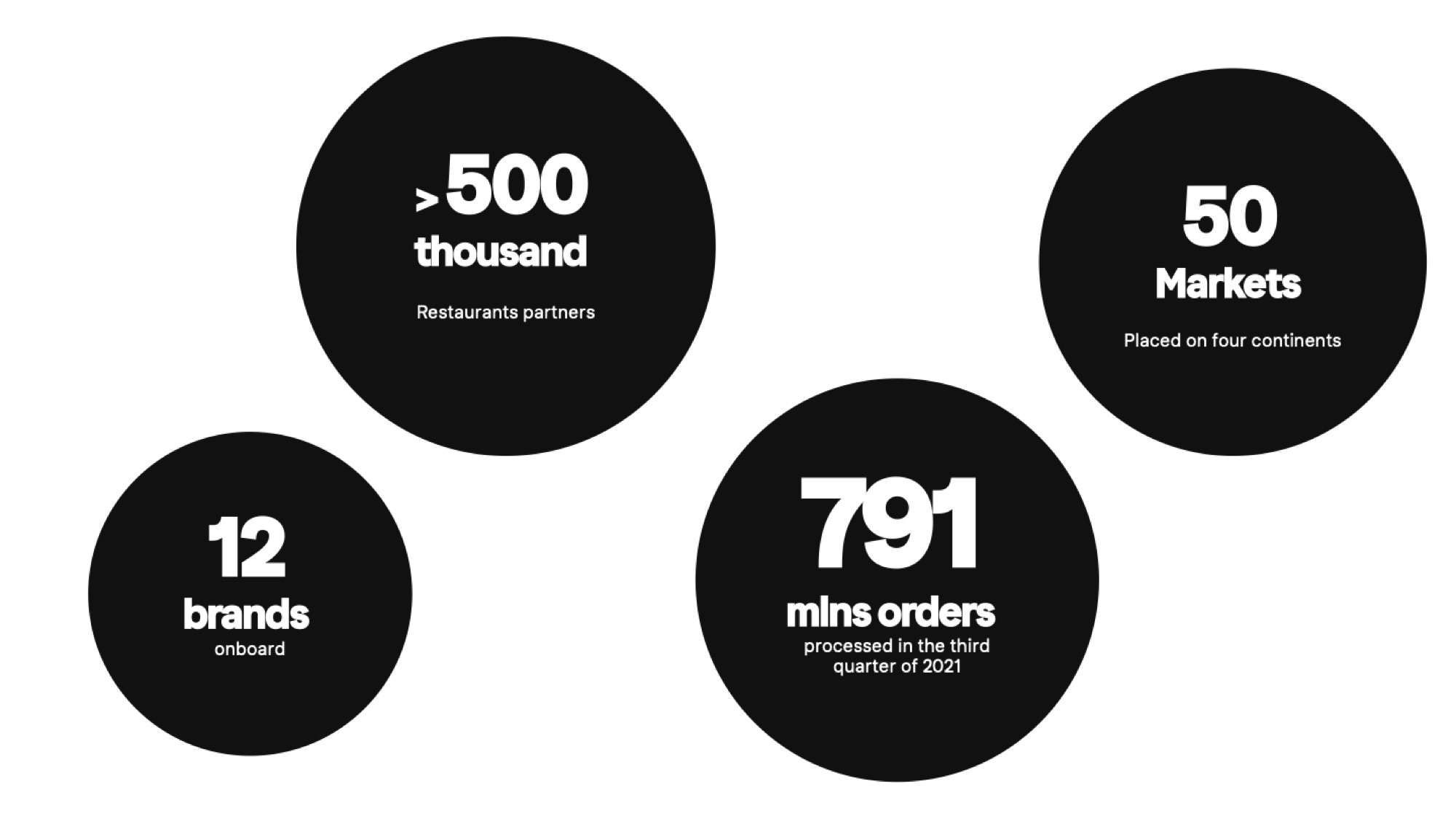
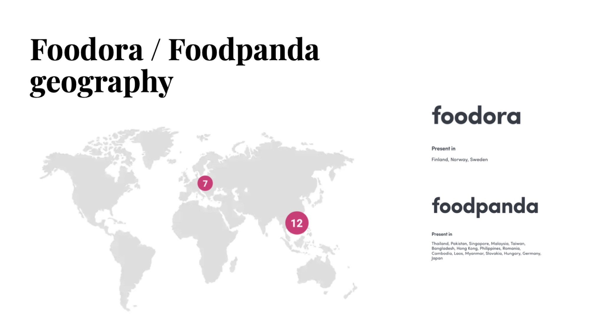
Delivery Hero is a marketplace at platform scale: 500k+ restaurant partners, 791M orders processed in Q3 2021, 12 brands, 50 markets across four continents. "Location" is the entry point to all of it: pick the wrong address and the whole funnel breaks downstream.
The address experience had three jobs to do at once — and was failing all three:
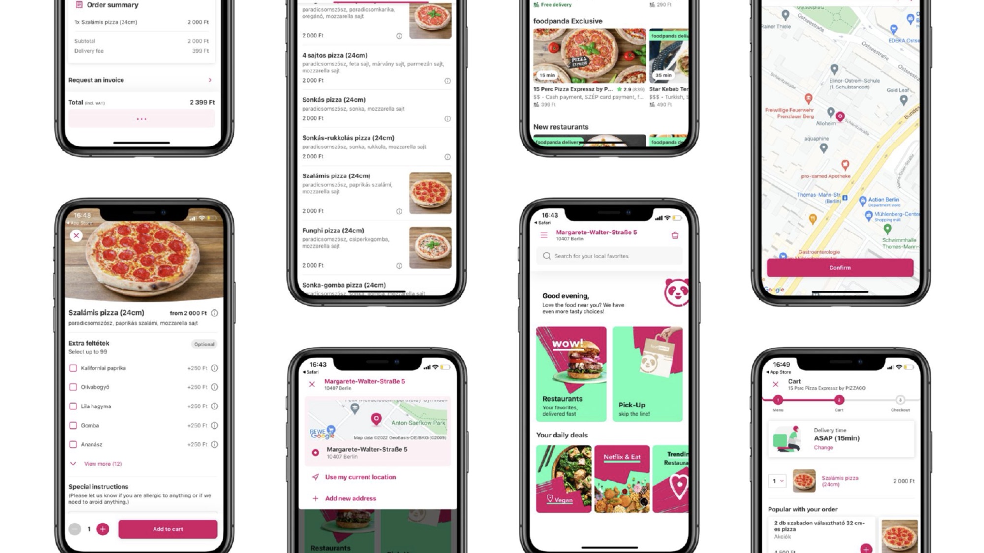
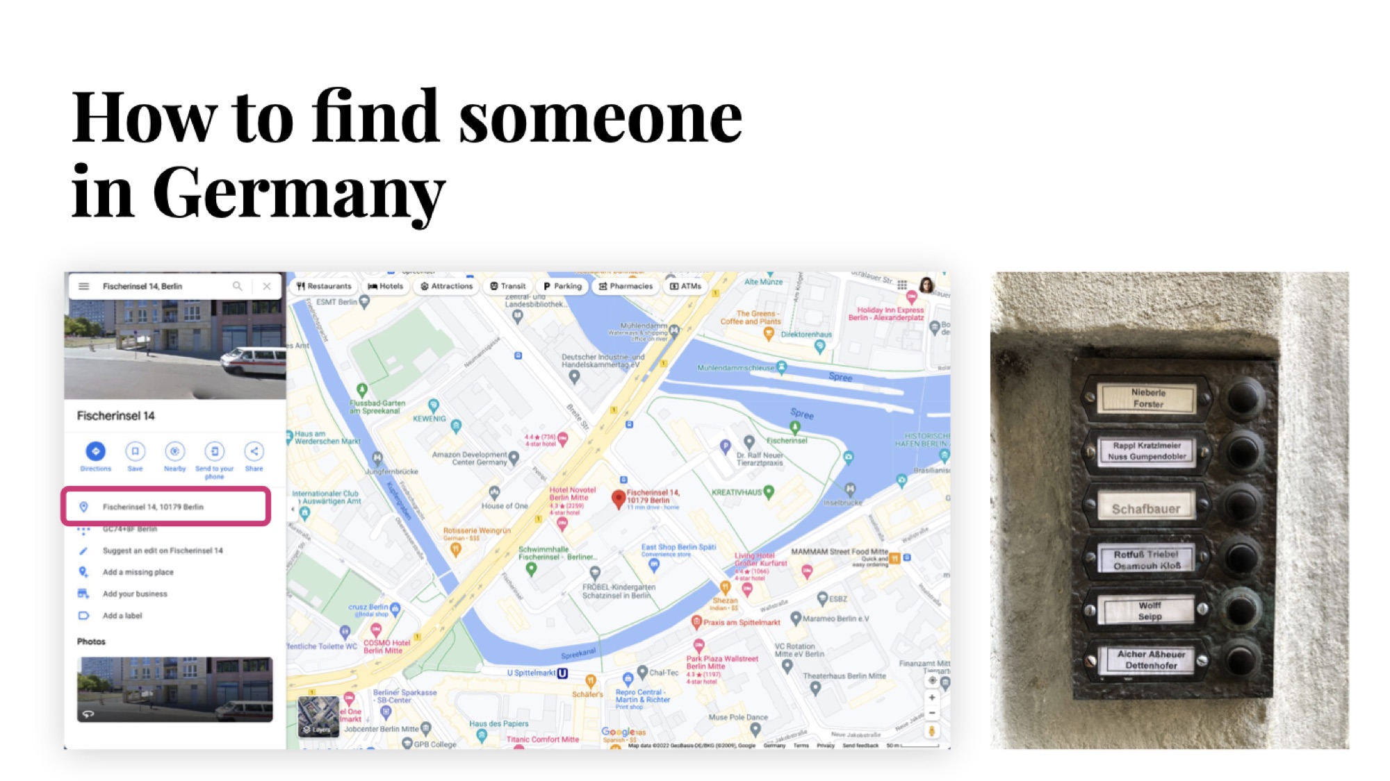
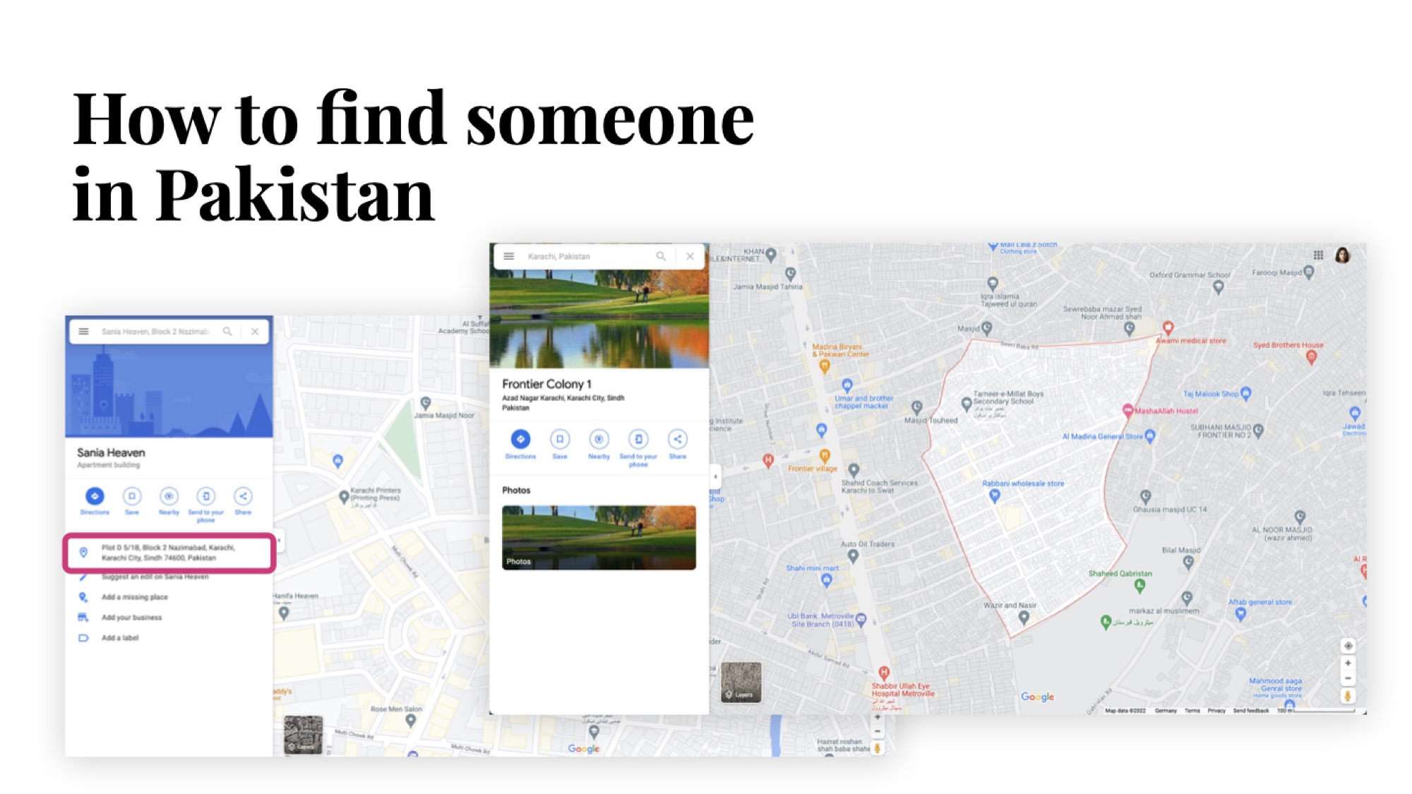
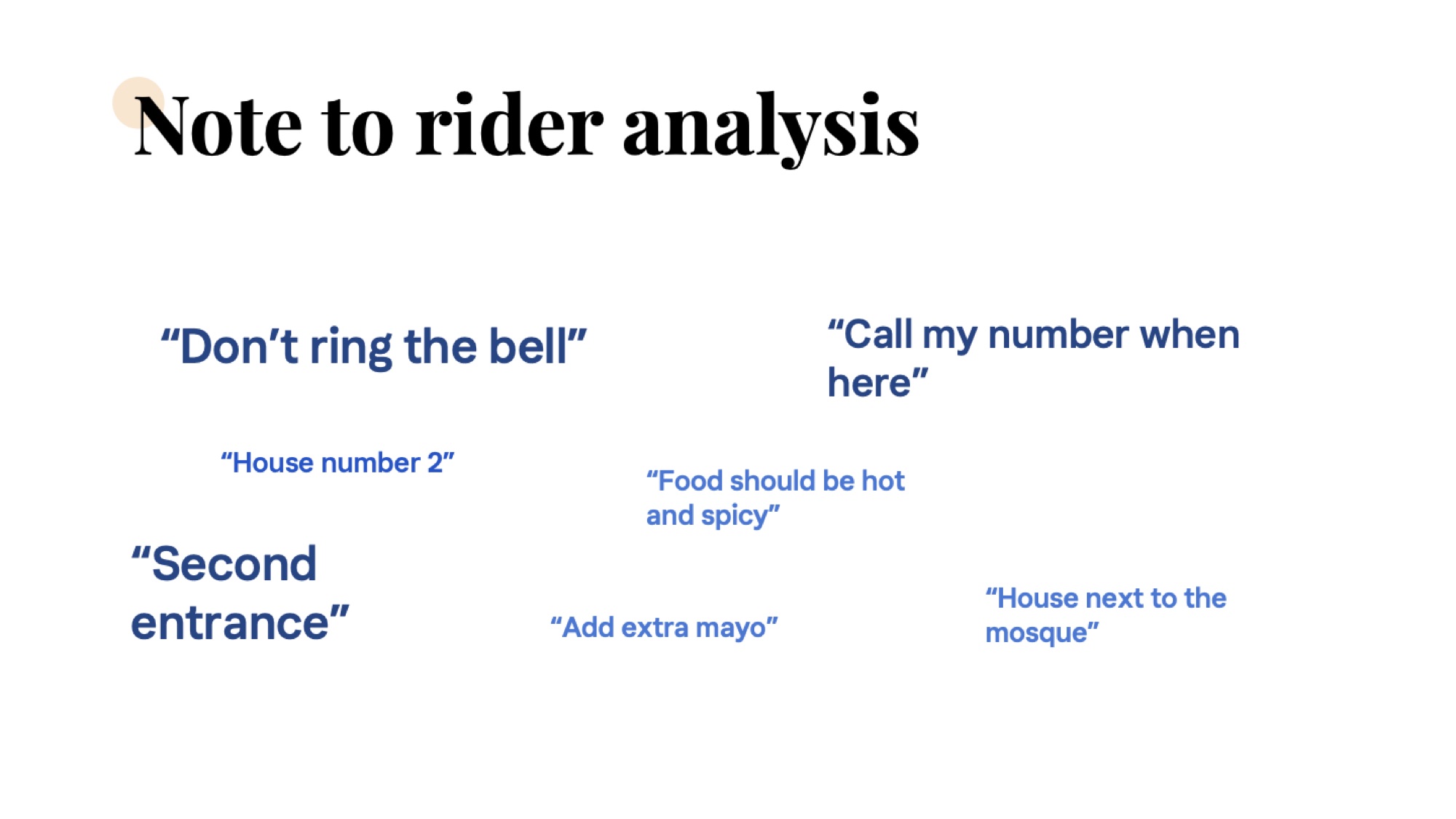
Delivery details in checkout were displayed only in text, auto-filled from Google geocoding. That's fine for Berlin or Helsinki, where an address is a postcode + street + number. It breaks in Karachi, Dhaka, Manila — where the operative unit is a landmark, a courier's local knowledge, or a multi-step description ("house next to the mosque", "second entrance"). The text-only flow couldn't carry that information.
Design lead for the topic of location. I owned the address experience end-to-end across iOS, Android, web, and mWeb — from problem framing and competitive benchmarking, through prototyping and user testing, into field research, A/B testing, and platform-wide rollout.
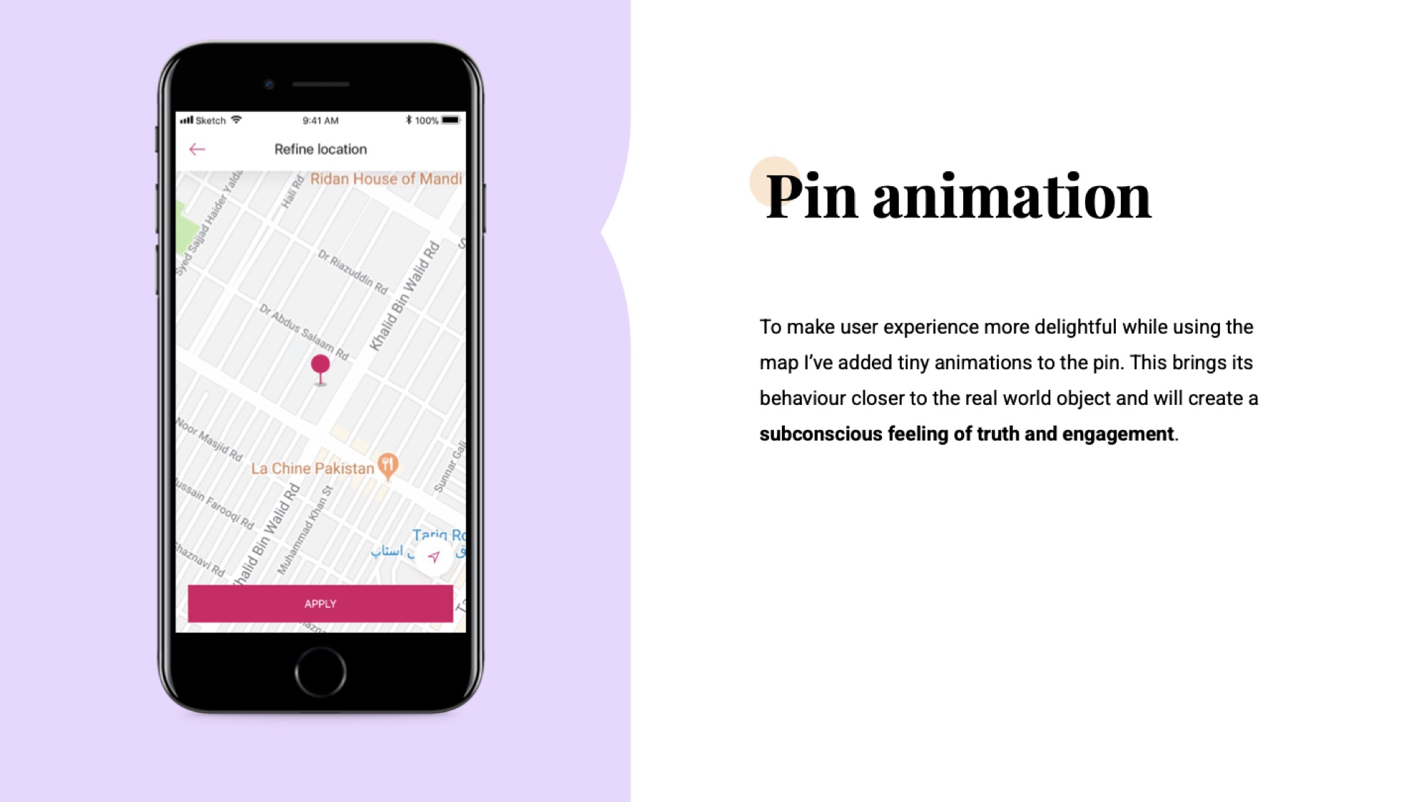
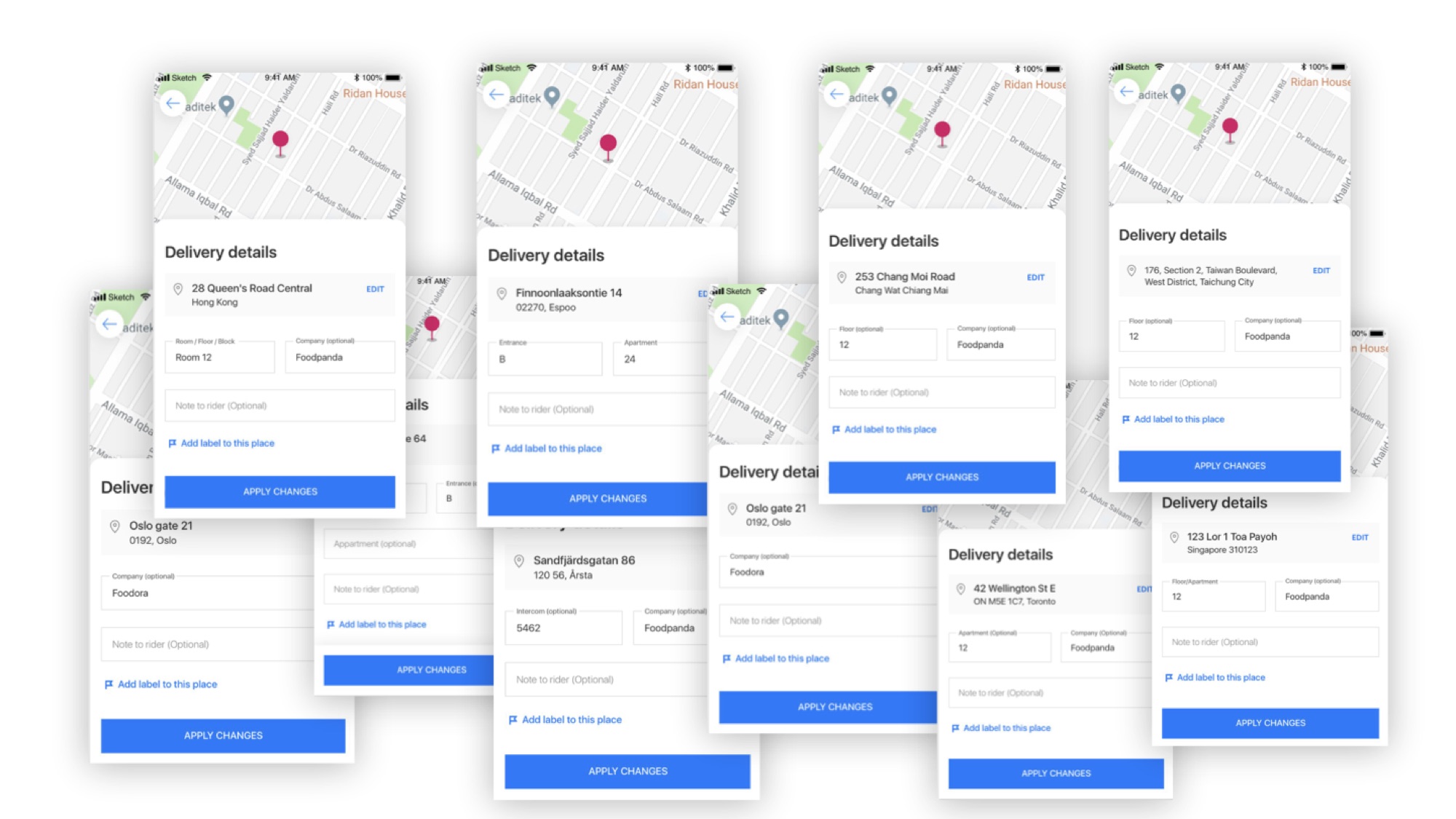
The redesign moved the map from a passive preview to the primary element of the screen. Subtle map animation and a small pin animation on placement signal — without copy — that the map is what the system trusts. Free-text "note to rider" remained, because in Pakistan that field carries genuinely useful information ("call my number when here", "second entrance"). The redesign respects that without elevating it above the pin.
We kept the free-text "note to rider" field, but only after auditing what people were writing in it. The signal was clear: the field wasn't being misused as an address — it was carrying genuinely useful, geocoder-invisible context. Killing it to force address structure would have made deliveries worse, not better.
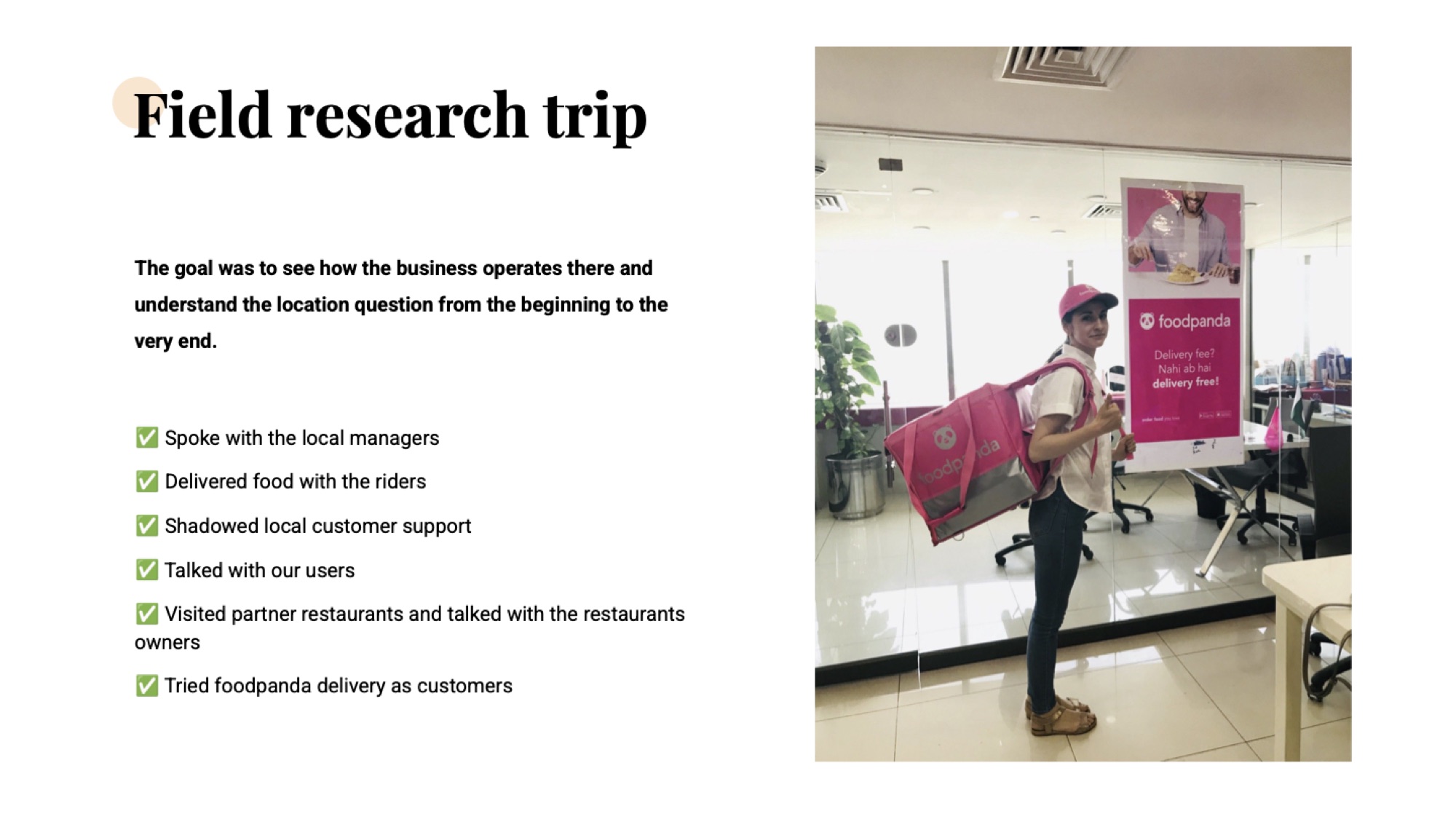
The first prototype shipped as an A/B test in Pakistan and showed no significant improvement. That's a result, not a defeat — and it's what triggered the field trip. Sometimes the most honest design move is admitting the hypothesis was incomplete.
You cannot design address UX for Karachi from a desk in Berlin. I flew out, sat with the local managers, did delivery shifts with riders, shadowed customer support, visited partner restaurants, and ordered as a regular customer for a week.
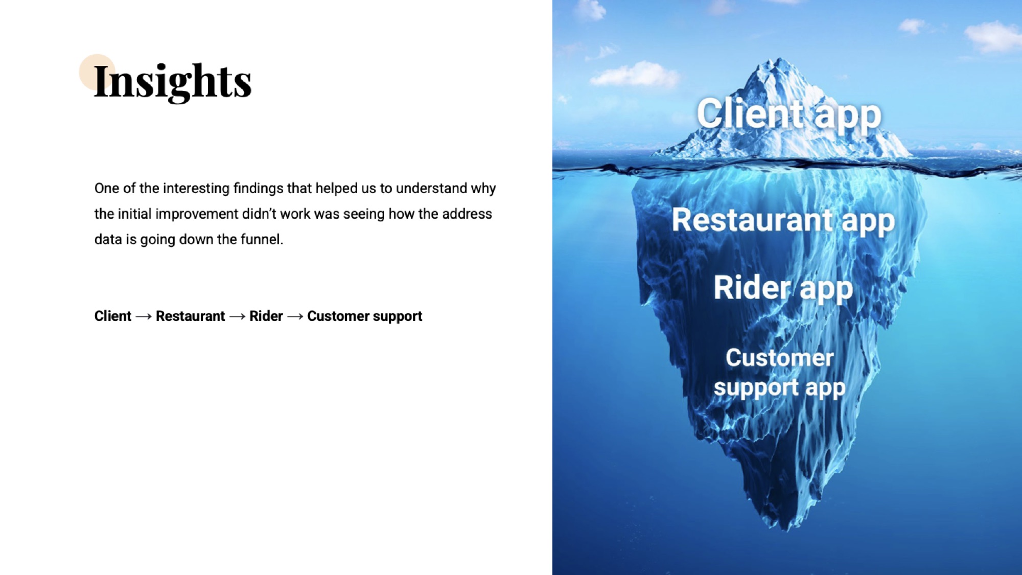
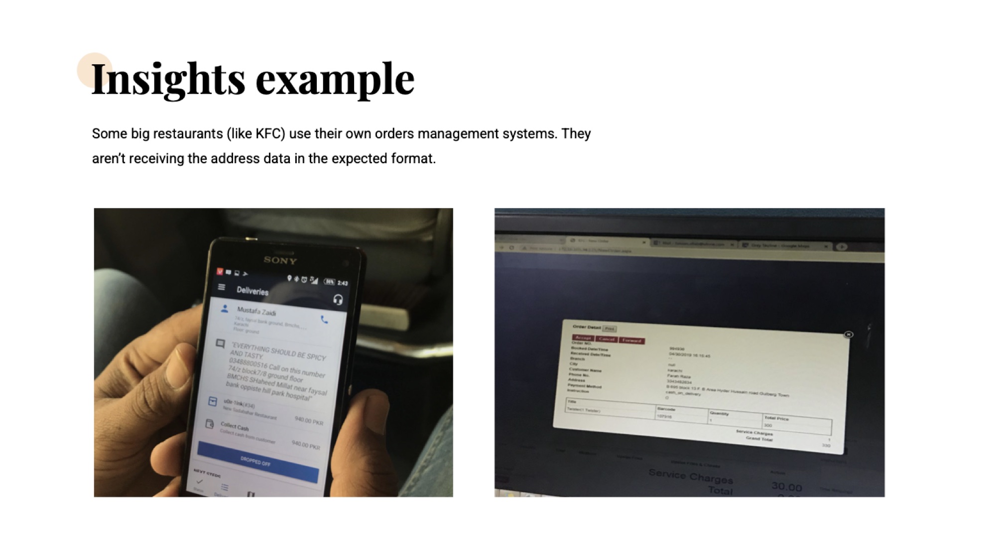
The trip surfaced the actual reason the A/B underperformed: address data degrades as it flows down the funnel. The structured pin a customer sets at checkout doesn't stay structured. It gets reformatted by the restaurant's order system, re-typed onto a packing slip, eyeballed by the rider, and finally re-explained over the phone to customer support. By the time it lands at someone who can act on it, the precision is gone.
Riders and customers preferred voice. That insight shaped how we built the rider-chat feature — a small example of how a UI decision lives downstream of a research finding rather than upstream of one.
V2 rolled out across markets and was extended to web and mWeb so the address data captured was consistent regardless of surface. Pin icons, copy, and map access points were aligned with the new checkout flow rather than treated as a separate vertical.
Cut into the 13k+/month "vendor doesn't deliver" cancellations and the €78k/month revenue leak.
All three secondary KPIs improved on monitoring — overall CVR, mCVR in checkout, and rider drop-off accuracy.
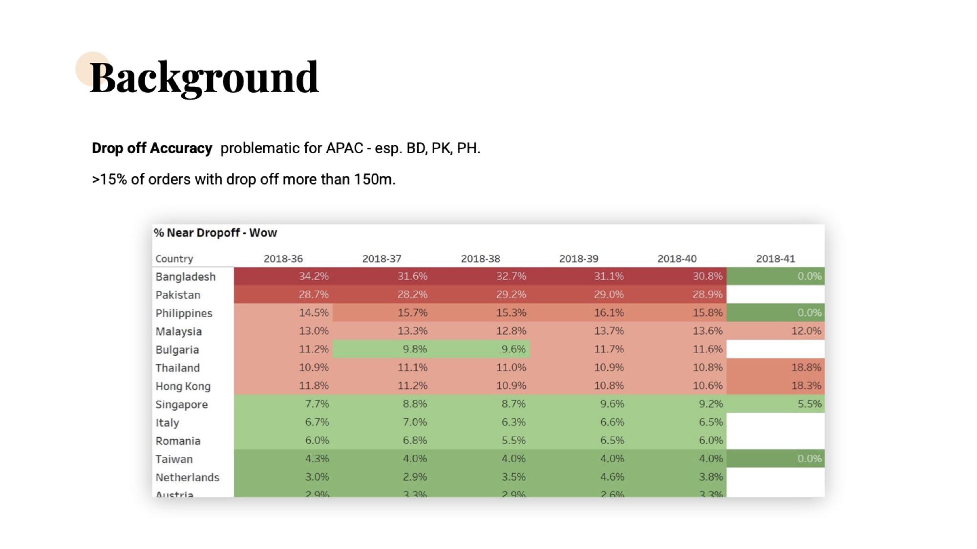
Drop-off accuracy moved off the 15%+ APAC baseline that anchored the case.
Map-based picker rolled out across Delivery Hero brands · 19 markets.